New CA Logo ICAI Guidelines and Download
Official logo, color palette, usage rules & branding resources
PracticeGuru
dated: 14th February, 20243 Min Read
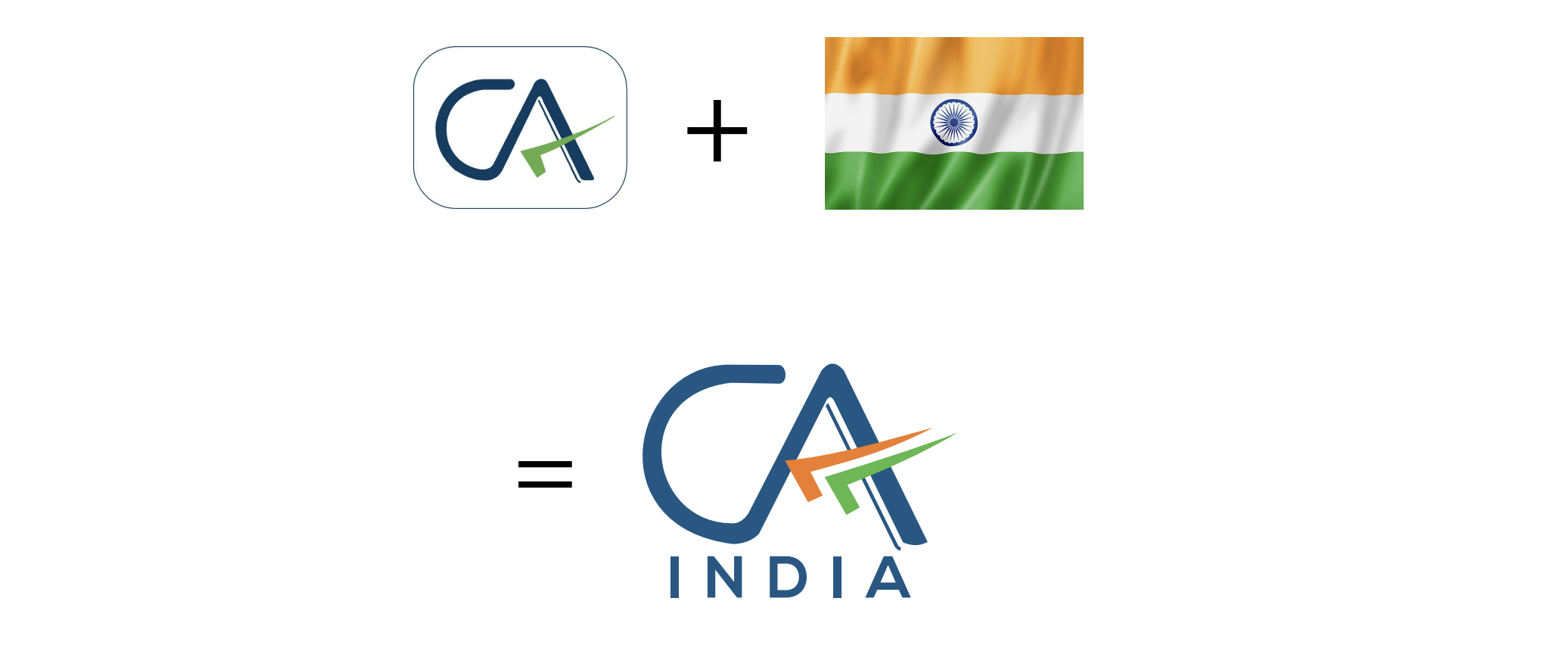
At the recent Global Professional Accountants Convention (GloPAC) in Gandhinagar, Vice-President Jagdeep Dhankhar, alongside Commerce and Industry Minister Piyush Goyal, introduced the new CA logo. Aniket Sunil Talati, President of ICAI, emphasized the logo's embodiment of 75 years of trust and excellence. He highlighted it as a symbol of the Indian accounting profession's commitment to contributing to the nation's growth, rooted in Indian values and heritage.
1. Significance of New CA Logo
Ranjeet Kumar Agarwal, Vice-President of ICAI, discussed the significant role Chartered Accountants play in the economic development of India and their contribution to enhancing the country's image globally. He noted that the new logo signifies the profession's dedication to maintaining the highest standards of excellence, independence, and integrity. This, he believes, will further promote the Indian accounting profession on the international stage. The introduction of the new CA logo aims to provide Indian Chartered Accountants with a distinctive identity worldwide, signifying their part in a network of highly skilled and trustworthy professionals. This move is designed to enhance the international recognition of Indian CAs, ensuring their qualification is distinguished in the competitive global market. The logo represents not just the profession's rich heritage but also its forward-looking vision to be globally competitive.
2. Incorporation of Tricolor:

The incorporation of the tricolor into the logo is a powerful symbol of the Institute's connection to India. The three colors of the Indian flag represent unity, diversity, and sovereignty, and they reflect the brand’s commitment to serving the people of India and contributing to the nation's development. The tricolor has been used in such a fashion that it hints at motion, a flight, and a journey toward progress, showcasing the Institute's forward-thinking approach.
3. Significance of blue color:

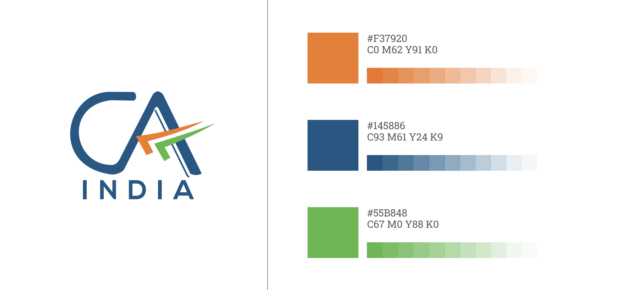
The primary color of the new logo is blue, which has been culled from the ICAI logo. Blue is a color that is associated with divinity, immortality, bravery, and determination. It reflects vastness, being the colour of the sky and ocean, and has been an integral part of the Indian cultural, political, and social landscape over the years. Blue is also culturally significant, as it has been a part of the Indian tradition for more than 5,000 years.
4. Adaptability on all platforms:
The new logo can be adapted for use on all platforms, digital and analog, which is essential for a modern brand. This versatility ensures that the Institute's brand is consistent across all channels, helping to strengthen its identity and credibility. The adaptability of the new logo also makes it more accessible to the Institute's stakeholders, including members, students, and the general public.
The new logo of CA India reflects the brand's connection to India while retaining its existing identity. The incorporation of the tricolor, the significance of the blue color, and adaptability on all platforms are all essential elements of the new logo. The design is intended to be aesthetically pleasing and culturally significant, making it a strong representation of the Institute's values and commitment to serving the people of India.
5. Colour Palette
6. Guidelines (2023) for using the new CA India logo
The logo consists of the letters 'CA' in blue colour with a tri colour tick mark (upside down) with white background. The blue colour not only stands out on any background but also denotes creativity, innovativeness, knowledge, integrity, trust, truth, stability, and depth. The upside-down tick mark, typically used by Chartered Accountants, has been included to symbolise the wisdom and value of the professional. 'India' is also added in the logo, as it epitomizes the Institute’s connection to India First approach and commitment to the serve the Indian economy in public interest.
- There should be no alteration of the font (colour, bold/unbold, size). Moreover, there should be no change in spacing and dimensions.
- The colour palette is given above.
- Do not change the design and colours including the white background.
- Refrain from rotating or tilting the logo clockwise and anti-clockwise.
- The logo should not be shrunk or distorted changing the original proportion.
- While members are encouraged to use the new CA India Logo as published on letterheads, visiting cards, website etc, a transition time of one year has been provided to use existing stationary/signage replacement etc.
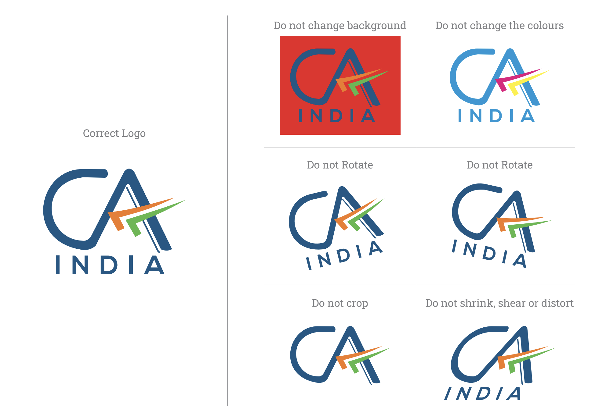
In conclusion, follow these guidelines strictly while using the New CA Logo.
.
Disclaimer:The information contained in this website is for general information purposes only. The information is provided by PracticeGuru and while we endeavour to keep the information up to date and correct, we make no representations or warranties of any kind, express or implied, about the completeness, accuracy, reliability, suitability or availability with respect to the website or the information, products, services, or related graphics contained on the website for any purpose. Any reliance you place on such information is therefore strictly at your own risk. In no event will we be liable for any loss or damage including without limitation, indirect or consequential loss or damage, or any loss or damage whatsoever arising from loss of data or profits arising out of, or in connection with, the use of this website.
You may send in your articles on [email protected] . We will publish them on our website with credit to you.


.png)
.png)
.png)
.png)
.png)


